Sunday, October 28, 2012

Stitching The Heart.

h
This technique of stitching the heart onto the wire (which I used on the lungs)  had always been my intention. I was delaying it though because i liked the way it looked on the clamps and I was worried also I'd mess it up or just be disappointed with the outcome and not know where to go next. It took a second go of doing but I'm really happy with it. Like the way the stretched silk and wool has a membraneous living tissue feel. The stitching also emphasises the whole textiles themes, both personal (the desire to live in the physical world and have a useful physicality) and a more generalised fascination that our anatomy IS of such physical matter, maybe as vulnerable and delicate as the silk and wool.

More progress with the felting technique and wire.


Felted shapes pinned to wire. At this point not sure how to attatch.


These white coat hanger/cobwebby felting things are the lungs. I tried first to make the shape of the wire the felting was going to fit in and the stitch it on (left triangular shape). Then I got the idea (remembering last years textiles class - god bless Barb for her thoroughness) I could actually felt the wire into the wool ( thus bypassing the stitching). The little circle cocoon was a practice piece and I thought this was pretty cool. So off I went and did that for both lungs (are they called lobes? Should look that up...)...
Anyway this is how that worked out and at first I was pleased and then on further rumination realised I wasn't really pleased. Which felt crap because I didn't know where to go next...


So onward. I decided to redo them and hope for better. Using sharp scissors I cut the felt shapes off at the boundary. I liked how they held their shape. Then I figured on stitching them back on using the stitching to further the conceptual aspects. It took three goes to get the stitching right but finally I'm happy(ish) enough with them. Next the heart.


Monday, October 22, 2012

Progress with textiles and anatomicals.


Played around with some wire to get these abstracted anatomical shapes. The wire is important because it is very coat hanger like and I hope (I think) to have them hanging like coat hangers of a rail/rod inside the box/wardrobe. I cut some of this divine red silk to fit the heart frame and carefully felted the outsides, not sure in this instance how much shrinkage I wanted or would eventuate from the process. I wanted  a membraneous finish with the wool and the silk and I'm pretty happy with what I got, trading it off for some rippling off the chiffon. The end result was smaller than in the photo shows, but was able to be stretched taut with in the frame with same mini clips (bought from office works on a whim - I knew they'd come in handy!). I intend to stitch the heart/textiles to the wire frame (trampoline-esque) but for the time being I like this clamped effect. What do you think (feedback please)?

Wednesday, October 3, 2012

In Need of Felting Skills Fast.


Having decided on textiles as a significant component of my work, to represent the anaotomical, I've settled on wool and Nuno felting. This is after many various other trials with calico, raw silk, transfers etc etc which seemed to fall short of what i wanted. Unfortunately I don't have a lot of experience with felting though I know that it is incredibly versatile and can create various beautiful textures. So a lot of playing. Or maybe it would feel like playing if it wasn't such a labour intensive process or I wasn't sick. Or didn't feel obsessively aware of the deadline. Or had more experience....
So lots of trials. The most successful for the 'heart' seems to be with some beautiful cherry coloured silk chiffon and Nuno felted around the edges with different shades of red marino tops (the upside of this preocess is the gorgeous materials). Eventually I got what I wanted but now I need to perfect the shape and decide on the wire structure. Progress I think.

Tuesday, September 25, 2012

Box One and Box Two

Midsemester reviews tomorrow and I really need to clarify my thoughts. Fortunately remembered how useful the blog has been for this so here goes....
These two boxes - not actually made yet, these are just digital mockups - are about 420mm x 31mm x 120mm. Thats not counting the 'head' and 'legs'. Hopefully the first thing you are getting from them is some Ostranenie. It would be good too if you were getting generalised pictures of alters, closets/wardrobes and even coffins. 
 
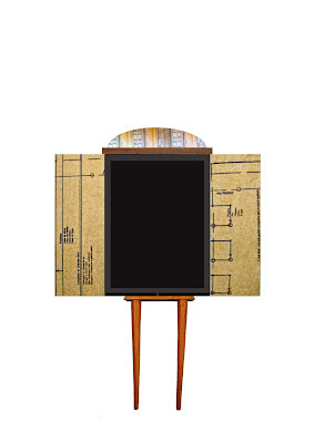
Box 1 on the left is about the self existing in the physical and material world.  This world has strict limits for defining life and it's prescriptions fall into quite narrow boundaries. It's almost like a recipe - enough calcium, sodium, amino acids all in the right proportions and you can have perfection. If your physical self falls into those narrow boundaries then lucky you, you get to have a life. For a while anyway. Because here's the bad news about the first box: material things don't last, they are temporary and they decay, inevitably, crumbling around you as though you are all artifice. If you are wholly wedded to this physical world (just like our culture with it's emphasis on youth, beauty and physical prowess) then does the crumbling artifice cancel you out of existence? If not, what is left? 
Box 2 attempts to make some sense of what is left when the physical and material world are unavailable to you or are insufferable. It attempts, from my own experience with disabling illness, to visualise an alternate world not reliant on the body or even the mind.
Two key inspirations have helped inform this vision. The existential/absurdist vision and the metaphysical vision. (Bit worried they are theoretically incompatible. Need more research here, but nonetheless this is my experience...). The metaphysical, takes inspiration from a poem by Franz Kafka (not co incidentally Kafka is considered an absurdist philosopher which may solve my incompatibility problem)  which reflects the essence of life as something that is all around and within and does not need an able body or even a particularly erudite, functioning mind to experience. (Halellujah). With a certain transcendence the world can come to you 'reveal itself, it has no choice, it will roll in ecstasy at your feet'. Not only is it a beautiful vision but it reveals also the cosmic joke - that life was right there in front of you, all the time you spent looking for it, like a lost sock.
The existentialist/absurdist vision is one I hold dear as it became the only framework within which I could comfortably view my otherwise inexplicable circumstances (the constant why?). Not far from this framework sits my notion of a vintage circus with it's sideshow of freaks, excluded from the mainstream, watching 'life' from the sidelines. In my vintage circus they are not the joke. Instead with their unique position on the sidelines, they are audience, watching the rest of us play out our proscribed lives and they get the joke. That's the advantage of being on the sidelines, the head start on life's cosmic joke, and they are in on it from the start - the existential comedy*, the one that reveals itself to us all through pain and suffering sooner or later. 
The upshot? Box One will let you down. It's definition of life is exclusive and self limiting and it's material nature means an inevitable decay with no back up plan. 
Box Two is enduring. It allows for transcendence of the material world and it's in on the cosmic joke. 

*The existential comedy - that there is no meaning. Suffering is senseless but happens anyway. This position allows a detatchment from life's insults and appreciation of the joke.

Monday, September 17, 2012

Zombies Hate Stuff.


Decided today there aren't enough humorous watercolours out there. That's why it's so great to see artist Greg Stones get his book Zombies Hate Stuff published. Through a series of stand alone paintings Greg Stones shows us what kind of things Zombies hate which is quite a lot. Generally they seem quite disgruntled. For example they hate clowns, they hate weddings and they hate having to share. They also hate sheep, re-gifting and war re-enacters (I am with them for war re-enacters but find re-gifting if done with care can be a really green solution to household clutter).
Other things Zombies hate are:

Disrespect

Hippies

Unicorns.

Read Greg Stones interview with himself HERE:

Re-gifting.

Saturday, September 8, 2012

Visit To Megalo Exhibition.


So enjoyed my visit to the Megalo exhibition I thought it needed a post of it's own. Two standouts for me - Franki Sparke's zines (above) because of the wonderful graphic qualities in his woodcuts plus the quirky, humorous themes contained within. I LOVE zines and here you are able to buy one of them and take it home (affordable art!) - five to choose from - it took ages to make a decision. The other artist was  Arthur Desmarteux. The word 'awesome'  is so overused but Arthur's work could pretty much own the word. I desperately wanted to paste some of the exhibited silkscreens into this blog but images from his site are non html so go straight to the source here if interested. Below is an etching of his I found of the web that gives you an idea of his style sans the characteristic colour explosions in the silkscreens.


An off the web woodblock print of Frank Sparke below.


Even if you are only vaguely interested in printmaking and artist books I reccommend that you go, go, go to this exhibition before it ends. Glad I did.

Friday, September 7, 2012

Light Box Logistics.


One direction I'm going in is to try and create some 2D images based on my chosen themes then framed as though x rays. Meaning my images will need to be printed on acetate (no problem) and then the frames will have to effectively be light boxes (problem). My frames are 4cm deep so trying to configure a uniform light over the entire image working within the 4 cm depth to contain the lighting source is proving difficult and likely expensive. Already I have reduced the image size (should mention I don't actually have any images yet but thought I should first ascertain the do-ability of the concept before going to that length) from A4 to A5 and have bought a mini digital photo frame (Thanks Christine for that idea!) off ebay for it's LCD screen. Hasn't arrived from China yet but it's one possibility. So still problem solving I'm afraid...desperate to get making though....How is everyone else going?

Thursday, August 16, 2012

Exploration 6: Maquette Making.


Hard to know where to start with this one. It's a beginning - but of what I don't know. There's a wardrobe with a coffin type feel to it (nice), the clothes metaphor - which I'm insisting is a metaphor because I don't want to come out of this looking shallow - and a bit of a figurative quality using those legs for the wardrobe. Or rather some Ostranenie as Paul corrected me defined it. I like the Ostranenie idea because I think a lot of what I'm trying to say is about the inner world of the self in opposition to it's outer world. And how we consider our inner world - and who we are - as taking place within us which is ironically the flesh, blood, bones - the physical rather than the metaphysical. Getting confused? These ideas keep tangling up in my head. I had a great chat with Paul about anatomy and all his work on this topic and how the problematic physicality of the body - how it gets ill, ages and decays back into the earth - is what in fact brings us most into contact with who we are or our humanity. Which is kind of ironic. But true I think. For example I recently heard from a psychologist friend about a 95 year old man who had come to her for help, the first time in his life he had ever sought psychological help. My reaction was, wow, imagine, he's probably had some trauma in his young life and it has taken him this long to find the courage to deal with it and how inspiring that it is never too late to heal and evolve. Amazing......Unfortunately it was nothing that inspiring. The 95 year old man was seeking help because he was starting to lose some mobility (!!!) and the thought of surrendering some independence was giving him anxiety attacks. I know that the idea of a 95 year old still in great health and rarely having had a day sick should be celebrated but I found this man's story (surprisingly) sad. When our body lets us down it brings up a lot of feelings - anxiety for one - and to not have to work through some anxiety and reap the growth and awareness that brings until 95 just seems sad. And contrary to the human experience. 
Well, enough now for the analysing. Time to move on with photoshop and x-rays and see what comes of that...


Sunday, August 12, 2012

Exploration 5: In Case Of Emergency.


I love shadow boxes. I painted this one red and white then aged it a bit with oil paint. It reminds me of  one of those fire extinguishers housed behind glass that you can break in case of an emergency. The red and white stripe works in two different directions - the colours of first aid but also the colours of a circus. I aged it because I really like vintage circuses. They have the air of tired, dark sorrow - a life lived on the edges of society - but with an accompanying sense of absurdity. It puts me in the mind of existentialism. Maybe some existentialism or absurdist philosophy as first aid?????


Exploration 4: Text.

I'm really inspired by text based art. It offers a whole new dimension of lyricism and decoding with font being as important as syntax. And again the materials communicate. This idea comes from the discovery that written expression like prose and poetry can be a useful (if not superior) substitute for medication when it comes to pain and discomfort (caveat: excepting childbirth. Any one reading me a poem during child birth risks their life). I like the idea of of that classic cry of emergency "Is there a Doctor in the house????" becoming "Is there a poet in the house???" - reflecting the healing power of language in the darkest of circumstances.
For this exploration I cut out some felt letters, still going with my textile theme, but I quickly realised that wouldn't work. There is nothing about felt that screams. Instead you want a distressed urgent font in screaming capitals. Maybe this?


Saturday, August 11, 2012

Exploration lot 3: Textiles/Ornamentation.


This textile ornamental pattern, which uses various circles of raw silk in a 'bruised' palette, is intended as a stylised representation of an inflammatory skin condition called Erythema Nodosum - a condition considered a flag for various underlying disease process. I owe my inspiration also to Gustave Klimt whose decorative style and ornamentation (see below) have been long time inspirations. Interestingly I have since discovered in my research that these highly visible skin lesions signal, among other conditions, Syphillis - a disease said to be rife in Klimt's turn of the century Vienna and one that terrified Klimt so much he  include representations of it in his work. Some sources seem to suggest that Klimt contracted Syphilis early on in his life and that the illness was a contributor to his death though this seems difficult to verify. Nonetheless for myself I love that the association I made between Erythema Nodosum and Klimt's ornamental style portends some extra depth...


Tuesday, August 7, 2012

Exploration lot 2: X-ray and Photoshop.


Here is some exploration using Photoshop and an X-ray. This draws on my 'anatomy' inspiration file, looking at  ideas of illness (from a personal perspective) plus just a more objective fascination with human insides  - physical and the inferred metaphysical - and general other X-Ray related metaphorical  dichotomy such as revelation/denial; inner world/outer world; private/public; protection/exposure...
Experimenting with filters and the eraser tool at about 50% opacity (done quickly, so no Wacom tablet used unfortunately) here some x-ray type shadowy mark making which felt like a really useful discovery. 
Treading then into textile territory, which feels very much where I'm heading and in line with themes I'm playing with, I sketched a shadowy dress onto the x-ray - something outer now on the inner - so getting into my theme of fashion as symbol and metaphor. Metaphor for what? Not really sure, probably serving as hope/future affirming when juxtaposed with illness?
Third a photo of a heart I cast in plaster last year superimposed on the X- ray now looking more solid and earthly against the ghostly X-ray.

Sunday, August 5, 2012

Material Exploration: Blister Packs.


First bit of material exploration off the ranks: painkiller blister packs. These seem to me to have some potential though not sure what yet. But seeings as I have stored approx one half million of them in the garage over the last two years with a view to upcycling them one day I thought now might be a good time. Also as I have consumed their contents over that same time frame I feel there may be some thematic possibility there too. Gathered together they look to have a bit of a silvery, glittery bling quality so I'm thinking bling, fashion, party, pain, denial and working with personal themes to begin with. I still haven't played with these as much as I need to but here's what I came up with last Thursday. As I'm feeling really drawn to a textile challenge this semester I cut the little blisters out, leaving in as much foil as possible to turn them into sequins. Then, some machine stitching, experimenting with leaving thread uncut and otherwise uncut. Different arrangements etc etc. Feel like there's more to be done here, but a start at any rate.

Saturday, August 4, 2012

Word Of Mouth: Encounters with Abstract Art.

Ruth Waller Op Phase (Visitation).

Wednesday's studio class was an absolute treat. A trip to CMAG (Canberra Museum and Gallery) to take in some abstract art - the engagingly curated exhibition Word Of Mouth: Encounters With Abstract Art  showing the works of Nineteen emerging and established artists, working in a variety of mediums, and who are all connected in some way to Canberra through the Australian National University's School of Art - either through teaching or studying. I have always been fascinated with abstract art, in the way I have been with classical music - that is to say felt that there was a whole secret world out there I was unable to access, able to enjoy only for an initial asthetic appeal, and therefore missing something special. The beauty of this exhibition however is an accessibility, something it's curator Mark Bayly had intentioned with the curation, looking to appeal to a broad audience. We were lucky enough in fact to have Mark as a personal tour guide and in the half hour he guided us through the exhibition I felt the mysteries of abstract art both fall away and deepen - a door open into this exciting world of communicating with abstracted form (a particular work by Christopher Carmody, referencing faded book covers, was unexpectedly moving) leaving me not only eager to seek out more abstract work in the future but maybe even try some myself. Though I can only speak for myself I'm pretty sure the whole class left the exhibition feeling inspired.

Greg Hodge (detail from Magazine Mystics). 

Julie Brook (I Can Connect Nothing With Nothing).

CMAG Curator, and our personal tour guide, Mark Bayly, with works by Marie Hagerty. (Photo Source)